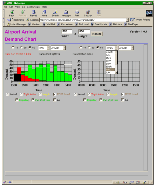
Airport Demand Chart (ADC) is a web-based, graphical display of airport arrival and departure information. In the same format as FSM’s demand/capacity graphs, ADC allows the user to view multiple airports on one screen. Select the desired airport from the drop-down menu provided above the graph and the time increment in which to view demand (15-min, 30-min or 60-min increments). Colored bars appear, which illustrate current demand on the airport. The colors correspond to a coloring scheme that the user chooses. The white line across the horizontal axis of the graph represents the current airport capacity. The user can view the data to immediately detect any demand/capacity imbalance and possibly take action on flights. Currently, ADC is in use at the FAA’s Air Traffic Control System Command Center and by several CDM airline participants to continuously monitor airports.
ADC File Listing:
No files found.